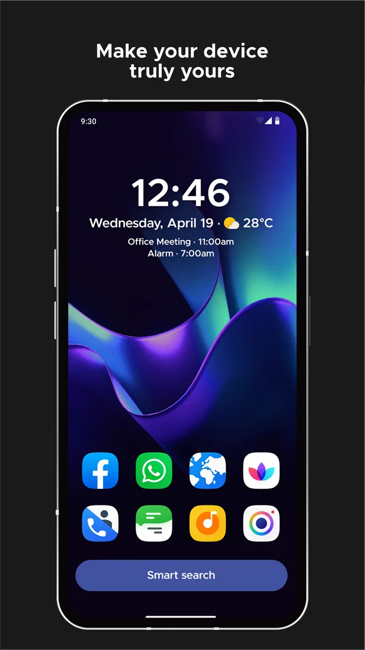
Smart Launcher 6 ‧ Home Screen
- 4.6
- Rating
- 50.00M
- Installs
- Free
- Price

 Analysis by App-foxy
I installed Smart Launcher 6 to see whether it could make Android feel calmer and more personal without turning the home screen into a project of its own. My first impression was that this is not simply a faster replacement for the default launcher. It is a personalization app built around organization, visual control, and reducing the small decisions that normally pile up every time I unlock my phone.
That distinction matters. Many launchers focus on making the screen look different, while others concentrate on gestures, speed, or an enormous library of customization options. This one tries to balance those goals. In my experience, it works best when I want my apps arranged sensibly and my screen to look deliberate, but I do not want to spend an entire afternoon manually placing every icon.
Smart Launcher 6 is free to install, is suitable for Everyone, and comes from the Smart Launcher Team. It has been available since July 11, 2012, and its long presence is reflected in the broad Android audience around it: the app has passed ten million installs, with an average rating of 4.6 from roughly 663 thousand ratings. Those figures do not replace personal testing, but they do suggest that this is an established alternative rather than an experimental home-screen replacement.
You May Also Like

 AccuWeather: Weather Radar
AccuWeather Review: A Quick, Clear Forecast for Everyday Decisions
For everyday plans, the best forecast is the one you can understand quickly. AccuWeather makes rain timing, radar, and local conditions easy to act on, with a few trade-offs.

 Hill Climb Racing
Why Hill Climb Racing Still Turns Crashes Into One More Run
A tiny car, a bumpy hill and one more upgrade: Hill Climb Racing keeps resurfacing because its simple chaos makes every near-miss feel personal.

 AliExpress - Shopping App
AliExpress Makes Global Shopping Feel Personal, but Shoppers Bear the Risk
AliExpress turns a global marketplace into a pocket-sized discovery engine. Its reach is useful, its shopping loop compelling, and its trade-offs easy to miss.

 Lords Mobile: Kingdom Wars
Lords Mobile Is a Kingdom-Building Routine, Not a Quick Match
A case-by-case verdict on the building, battles, device demands, and social commitments that make Lords Mobile rewarding for some players and exhausting for others.

 PDF Scanner app - TapScanner
TapScanner Makes Paperwork Easier to Capture, Check, and Share
TapScanner makes scanning with a phone feel less like a rescue operation and more like a dependable step in getting work done. Its capture tools are useful, though not flawless.

 Block Blast!
 Shows How Much a Puzzle Game Can Leave Out
A quiet grid game shows why puzzle players increasingly value instant clarity, repeatable skill and low-pressure play—and where the genre still needs to catch up.
More From Our News Desk
View All News


How I judged the launcher before changing my daily setup
When I compare a launcher with the one already on a phone, I do not begin with icon packs or wallpapers. I first ask whether the change saves time. Can I reach the apps I use every day without thinking? Does the layout remain understandable after installing something new? Can I make the screen feel like mine without fighting the system? Those are more useful questions than whether a screenshot looks impressive.
I also looked at the cost of switching. A launcher becomes part of the basic interaction with the phone, so even a small annoyance can become tiring when repeated dozens of times a day. I paid attention to the first setup, the way the home screen behaves after rearranging it, and how easy it is to return to a familiar arrangement if an experiment does not work.
The app is currently listed as version 6.6 build 002 patch 1 and requires Android 7.0 or later. That minimum requirement makes it relevant to a wide range of Android devices, although the experience can still vary depending on the phone manufacturer and Android interface around it. A launcher controls the home screen, not every part of the operating system, so it cannot erase every difference between devices.
Organization is the real reason to choose it
The strongest part of Smart Launcher 6 is its approach to keeping apps manageable. Instead of treating the home screen as a storage area for every installed app, it encourages a cleaner separation between what I need immediately and what I only open occasionally. That changes the daily rhythm of using the phone: the first screen becomes a useful starting point rather than a crowded collection of shortcuts.
This is especially helpful on a phone that has accumulated apps over time. I often install something for a single task and then forget where it went. A conventional launcher leaves me with two choices: keep adding pages or rely on the app drawer and search. Smart Launcher 6 makes the organized route feel more natural, so I can keep the main screen focused while still having access to the rest of the phone.
A practical workflow is to put only the apps that support repeated habits on the main screen: communication, navigation, music, notes, and the camera. Less frequent tools can remain organized away from that first view. This sounds simple, but the benefit is psychological as much as practical. When the screen shows fewer competing choices, I am less likely to open an app merely because its icon is visible.
One non-obvious trade-off is that automatic organization can be convenient without being perfectly aligned with my personal logic. I may think of an app in terms of what I use it for, while the launcher may place it according to a broader category. That is not a serious problem, but it means I still need to review the arrangement after setup. The best result comes from letting the launcher handle the broad structure and then making a few personal corrections.
Personalization without turning the phone into a hobby
The visual side is more flexible than a stock launcher, but I would not describe it as customization for customization’s sake. The useful question is not whether I can change every detail; it is whether the changes improve recognition and comfort. A restrained layout, a readable arrangement, and a background that does not compete with icons can make a phone feel noticeably easier to use.
I found it helpful to change one visual element at a time. Starting with a new wallpaper, a different icon presentation, and a completely redesigned layout all at once makes it difficult to tell what actually improved the experience. With this launcher, a gradual approach works better: establish the structure first, then adjust appearance only where it supports that structure.
That approach also protects against a common launcher problem: creating a beautiful screen that is inconvenient in real life. A minimal layout can look excellent in a screenshot but become frustrating if frequently used apps are hidden too deeply. I recommend treating appearance as the second stage. First make the phone easy to operate with one hand and under ordinary lighting; then refine the style.
The app’s focus on beauty and control will appeal to people who want more than the manufacturer’s default arrangement. However, users who prefer a completely invisible launcher may find the extra choices unnecessary. If the stock home screen already feels clear and you never want to adjust it, this app may offer more control than you need.
Small workflows that make a larger difference
My favorite use case is a phone shared between several kinds of activity. In the morning, I need communication and calendar-related tools. During travel, maps, tickets, and translation matter more. In the evening, entertainment and reading become more relevant. Smart Launcher 6 is useful here because it lets the home screen act as a stable base while the rest of the app collection remains organized instead of being rebuilt for every situation.
Another useful habit is to keep the first screen intentionally incomplete. I know that sounds counterintuitive, but leaving open space or limiting the number of visible shortcuts makes new notifications and temporary tasks easier to notice. I would rather have a screen that answers “what do I need now?” than one that tries to display everything I own.
I also recommend testing the layout for a few normal days before judging it. A design that feels efficient during setup may slow down a real routine if a commonly used app is one step too far away. The launcher is customizable enough that small changes can solve this, but the solution comes from observing your habits rather than copying a layout from someone else.
For people who frequently change phones, a consistent launcher style can also make the transition less disorienting. The exact device interface may change, but the basic way I expect to find apps and interact with the home screen can remain familiar. That is a practical advantage that is easy to overlook when comparing launchers only by appearance.
What it feels like beside the usual alternatives
The default launcher is usually the best choice for someone who values immediate familiarity and the fewest moving parts. It is already integrated with the phone, and there is no learning curve beyond what the manufacturer has chosen. Smart Launcher 6 is more appealing when the default arrangement feels cluttered, rigid, or visually uninspiring.
At the other extreme are highly manual launchers that offer deep control over grids, gestures, icon placement, and detailed behavior. Those alternatives can be better for enthusiasts who want to design every part of the interaction. I would choose that kind of launcher when exact positioning and extensive tweaking matter more to me than a guided structure.
Smart Launcher 6 sits between those categories. It gives me meaningful control while still encouraging a coherent arrangement. That middle position is its main strength, but it is also why it may disappoint someone looking for either absolute simplicity or total freedom. It does not need to be the most configurable launcher to be useful; it needs to make the right decisions easy to adjust.
There is also a difference between a launcher designed around search and one designed around visual organization. If I remember app names reliably and prefer typing everything, a search-first setup may feel quicker. If I recognize apps by location, grouping, and appearance, Smart Launcher 6 has a more natural advantage. The better choice depends on how I actually retrieve apps, not on which interface looks more modern.
The friction of moving from the stock home screen
The largest cost is not financial; it is muscle memory. I had to relearn where certain actions belonged and resist the urge to judge the arrangement during the first few minutes. Any launcher replacement creates that adjustment period, even when the new design is objectively cleaner. Someone who changes phones often or dislikes interface changes should expect this transition to be more noticeable.
Before switching, I would take a quick mental inventory of the current setup. Which shortcuts do I use every day? Which widgets are essential? Which gestures or behaviors do I rely on? This prevents the common mistake of installing a launcher and then trying to recreate the old screen without considering why it felt useful. Smart Launcher 6 works best when I use the move as an opportunity to simplify, not merely duplicate.
I would also avoid making the change immediately before travel, work, or another situation where the phone needs to be predictable. Give the new layout time to settle during ordinary days. If it does not fit, returning to the previous launcher is less frustrating when the experiment was planned rather than forced by a rushed setup.
There is a financial distinction as well. The app is free, while optional in-app purchases range from forty-nine cents to twenty-seven dollars and ninety-nine cents per item. I could begin evaluating the core experience without paying, which lowers the risk of trying it. Still, anyone who is sensitive to optional upgrades should review what is available before spending, especially if the goal is simply to replace a basic stock launcher.
Who should use it, and who should pass
I recommend Smart Launcher 6 to Android users whose home screen has become a dumping ground for icons. It is particularly suitable if you want a cleaner starting point, prefer apps arranged by purpose, and enjoy personalizing the phone without manually engineering every pixel. It also makes sense for people who have tried several wallpapers and icon styles but still feel that the underlying organization is the real problem.
I would be more cautious if you depend heavily on a manufacturer-specific home-screen feature or want the exact behavior of the phone’s original interface. A third-party launcher may not reproduce every detail of that experience. I would also skip it if I am perfectly happy with the current launcher and have no interest in changing the way I reach apps; adding another layer would not create much value.
Power users should decide whether guided organization or maximum control is the priority. If I want to construct an elaborate system of custom gestures and precise placements, another category of launcher may suit me better. If I want a polished structure that I can personalize without constant maintenance, this one is the more comfortable compromise.
For a family member who finds a crowded phone confusing, I would consider it a good candidate, but I would set it up together rather than changing everything remotely. The important part is not just installing it; it is choosing a layout that matches that person’s habits. A visually simple screen can still be inconvenient if the most important actions are not where they expect them.
My recommendation after living with the change
Smart Launcher 6 earns my recommendation because it addresses a real everyday problem: the home screen often becomes disorganized long before the phone itself becomes old. Its combination of categorization, visual customization, and a more intentional starting point makes Android feel less noisy without demanding that I become a full-time launcher designer.
The honest limitation is that the best result requires a little participation. I would not install it, accept the first arrangement blindly, and assume the phone is finished. Spend time correcting the categories, keep the opening screen focused, and test the layout during real routines. That small investment is where most of the benefit appears.
The current version, 6.6 build 002 patch 1, is a sensible point at which to try it, and the Android 7.0 minimum keeps the app accessible on older supported phones. Since the app is free to start and rated for Everyone, the barrier to experimentation is low. The optional purchases are worth considering only if the extra personalization fits your needs; I would not pay simply because the launcher is installed.
My clear advice is this: choose Smart Launcher 6 if your problem is clutter and you want a guided but personal solution. Stay with the default launcher if familiarity matters more than redesign. Choose a more manual alternative if you want to control every detail. For everyone in the middle, especially someone who wants a calmer phone without sacrificing personality, this is one of the more convincing launcher changes I have tried.
The key decision is not whether the screen can look different; it is whether the new arrangement helps you find what matters with less effort. In my experience, Smart Launcher 6 succeeds when I let it organize the phone first and decorate it second. That balance is what makes it worth recommending to a friend.
FAQs for Smart Launcher 6 ‧ Home Screen
01What is Smart Launcher 6 and how does it improve my device's home screen?
Smart Launcher 6 is a customizable home screen replacement app for Android devices. It enhances user experience by offering an intuitive interface, adaptive icons, and a variety of widgets. The app organizes apps and widgets in a way that reduces clutter and improves accessibility, making it easier to navigate your device efficiently.
02Does Smart Launcher 6 support customization and themes?
Yes, Smart Launcher 6 supports extensive customization and offers a wide range of themes. Users can choose from different icon packs, widgets, and color schemes to personalize their home screen. The app also supports adaptive icons, providing a more unified and aesthetically pleasing appearance across various apps.
03Is Smart Launcher 6 resource-heavy, and will it affect my device's performance?
Smart Launcher 6 is designed to be lightweight and efficient, ensuring it does not significantly impact your device's performance. It optimizes resource usage, providing smooth operation even on older devices. The app's efficient design helps in conserving battery life while maintaining a responsive user experience.
04Can I use Smart Launcher 6 on any Android device?
Smart Launcher 6 is compatible with most Android devices running version 5.0 (Lollipop) and above. However, for optimal performance, it is recommended to have a device with newer hardware and software. Users should check device compatibility and system requirements before downloading to ensure a seamless experience.
05Is there a premium version of Smart Launcher 6, and what additional features does it offer?
Yes, Smart Launcher 6 offers a premium version that unlocks additional features, including advanced widget options, more theme choices, and enhanced customization tools. The premium version also removes ads, providing a cleaner and more streamlined user experience. Users can choose to upgrade through in-app purchases to access these exclusive features.
Pros
- Highly customizable user interface.
- Efficient and fast performance.
- Smart search feature is intuitive.
- Minimalist design enhances usability.
- Adaptive icons for a modern look.
Cons
- Limited free version features.
- Some themes require purchase.
- Occasional widget compatibility issues.
- Ads in the free version can be intrusive.
- Lacks advanced gesture support.

Smart Launcher 6 ‧ Home Screen
Gallery